Record of metronome development
Testing Flutter’s multilingual UI revealed “300 BPM” split across two lines
Display tests for SANGE Metronome combined 12 languages, 6 screen sizes and 3 text scales. This article records the UI fixes and more specific automated assertions prompted by a line break in “300 BPM” and long error messages.
I checked how my independently developed app, “SANGE Metronome – Simple Rhythm Practice”, displays on small screens and with enlarged text.
One issue was that the digits in “300 BPM” on a favorite card split into “30” and “0”. The text was not overflowing off the screen, yet the tempo value had become difficult to read.
We needed to verify both the absence of layout exceptions and the readability of essential information.
This article describes the display issues found through widget tests in 12 languages and screen reviews in an Android emulator, and how those findings informed the fixes and tests.
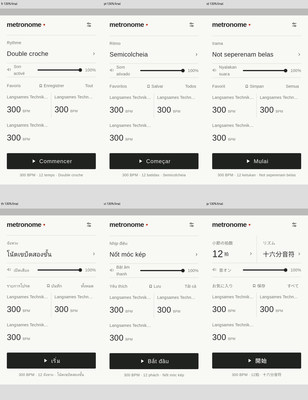
A layout that fits Japanese may not fit other languages
The metronome screen shows not only tempo digits, but also beats, rhythm names, volume and favorite names. The Save screen also needs an input field, error explanations, and Save and Cancel buttons.
Even when a layout fits in Japanese, translating changes label lengths. For example, Japanese “12拍” and German “12 Schläge” require different button widths.
Larger text also means that elements arranged side by side no longer fit. Instead of changing only the language, I decided to combine screen sizes, text scales and the screen being displayed in the checks.
Automated checks across 12 languages, 6 sizes and 3 text scales
The widget tests combined the following conditions. Widget testing renders Flutter UI components in a test environment so that their behavior and layout can be checked.
| Test dimension | conditions |
|---|---|
| Language | Japanese, English, Spanish, Brazilian Portuguese, German, French, Korean, Indonesian, Vietnamese, Thai, Traditional Chinese and Italian |
| Logical size, portrait | 320×568、360×640、360×800、393×873、412×915、432×960 |
| Text scale | 100%, 130% and 200% |
| Screens | Home, beats, rhythm subdivision, settings, language selection, save, favorite management and favorites list |
12 languages × 6 sizes × 3 text scales × 8 screens = 1,728 conditionsThe test data used 300 BPM, 12 beats, sixteenth notes, 100% volume and three favorites with long names. The Save screen also displayed the duplicate-name error.
Text scaling was specified with TextScaler.linear. The 100%, 130% and 200% settings in these tests scale text linearly; they do not reproduce every aspect of text enlargement through a physical device’s OS settings.
Images were also collected in an Android emulator for seven languages: German, French, Brazilian Portuguese, Indonesian, Thai, Vietnamese and Japanese. This was not an exhaustive combination of every size, scale and language. Screen sizes and text scales were checked in German, while the other six languages were checked at a 360×640 setting and 130%.
System bars reduce the area available to the app in the emulator. Along with the configured size, I recorded the logical size at rendering time and the size within SafeArea.
Adjust beat-button columns to fit the text
The first issues found were tempo descriptions and beat units overflowing on the right. The Android emulator also reported RenderFlex overflow, which required a layout revision.
Beat selection also used a fixed four-column layout. However, longer translated labels or larger text scales leave insufficient width for that many columns.
I therefore measured translated labels with TextPainter and determined the number of columns from the required width, including text scaling. In narrower conditions, fewer columns let the buttons extend vertically.
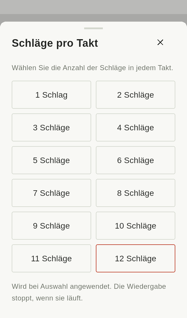
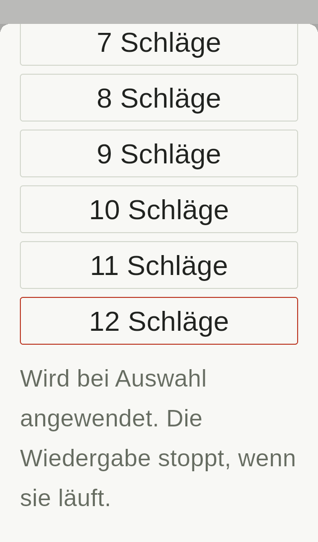
The home screen’s narrow two-column layout for long rhythm names was also revised so that beats and rhythm stack vertically when necessary. To address split digits for beats 10–12, the overall beat display was allowed to wrap onto multiple rows.
Splitting “300” does not always raise an exception
While reviewing the images, I noticed an issue with favorite cards at a 320×568 display setting and 200% text scale.
The cards still used three columns, which caused a line break within “300”. Even if the text remains inside its display area, splitting the digits into “30” and “0” makes the tempo difficult to read.
Checks for layout exceptions alone did not detect this issue.
The fix adjusts the number of favorite-card columns to the text scale. At 200% on the small screen tested here, the cards use one column so that tempo digits stay together.
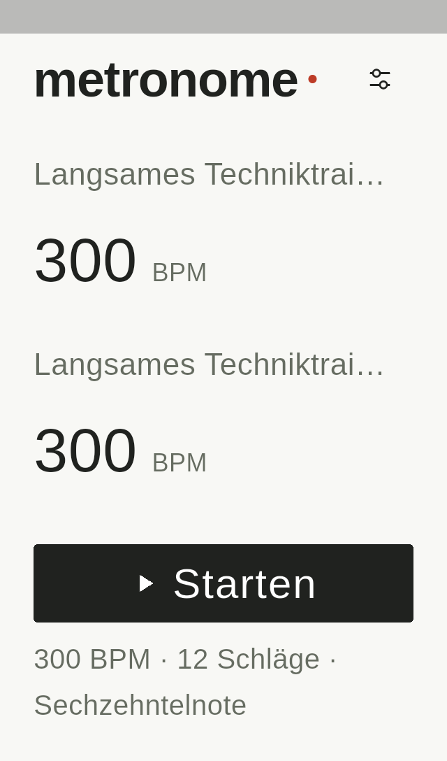
Alongside the fix, I added an automated assertion that a three-digit BPM value fits on one line. The following is an excerpt of that check.
for (var card = 0; card < 3; card++) {
  final paragraph = tester.renderObject<RenderParagraph>(
    find.text('300  BPM').at(card),
  );
  expect(
    paragraph.getBoxesForSelection(
      const TextSelection(baseOffset: 0, extentOffset: 3),
    ),
    hasLength(1),
    reason:
        '$locale/$size/$scale favorite BPM must stay on one line',
  );
}
The check confirms that the character range corresponding to “300” has a single rendering box. The actual tests checked the BPM in each of three favorite cards, as well as beat numbers 1–12 on the home screen.
This method targets the digits rendered in the same typeface in these tests. It is not a general-purpose way to determine line breaks in text mixing different languages or typefaces.
Make assertions specific to the information the UI needs to convey. A useful outcome was turning an issue found in screenshots into an automated check that can detect it after future changes.
Can the full error message and Save button be reached?
The Save screen’s error-message line limit was also revised.
The error message was originally limited to three lines, so a long translation might not fit when text was enlarged on a narrow screen. I removed the line limit and made the full explanation accessible by scrolling.
Save and Cancel buttons now stack vertically on narrow screens or with larger text. The modal heading and close button, as well as setting names and selected values, were also rearranged to give text enough width.
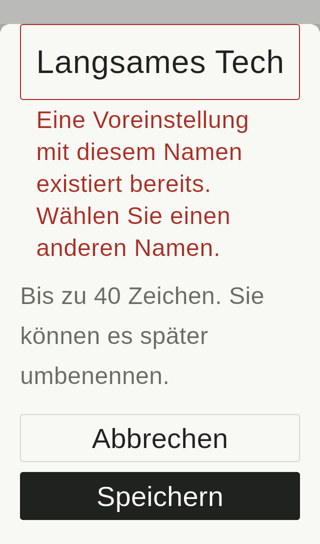
Checks while entering text were also added. The widget tests reserved a bottom inset of 280 logical pixels to simulate a keyboard and verified that scrolling brought the Save button above that area. They also checked that error messages were not truncated by a line limit.
In the Android emulator, I actually focused the input field and checked the layout with the keyboard open. However, these PNGs capture only the Flutter surface and do not include the OS keyboard itself. Normal and text-entry states were recorded separately.
Results after the fixes and the scope of verification
These are the results of the checks performed on October 30, 2026.
| Item | Result |
|---|---|
| Display widget tests | No layout exceptions across 1,728 conditions. Checks for split numbers, truncated error messages and access to the Save button also passed on the relevant screens |
| All Flutter tests | 121 tests passed |
| Static analysis | No issues reported |
| Android emulator screen conditions | 280 conditions. In every run, layoutErrors was 0 |
| PNGs collected | 478 images, including scrolled and text-entry states |
1,728 is the number of display-condition combinations; 121 is the total number of Flutter tests run. They are separate figures because each test repeatedly checks multiple display conditions.
The figure 478 is the number of PNGs collected. Rather than assigning an individual visual pass or fail to every image, I selected key screens to check for missing or overlapping text, split numbers and the view after scrolling. The inspected Thai and Vietnamese screens also showed no missing-glyph boxes or overlapping text.
In addition to six synthetic sizes, the emulator used six device display profiles: Galaxy A16 5G, A06 4G, S24+, S23, Redmi 14C 4G and Pixel 9. I prepared 30 device profiles, but ran six of them in this verification.
These settings applied resolutions and approximate test densities to the same Android 14 emulator. The checks did not reproduce manufacturers’ custom operating systems, fonts or camera cutouts, and did not use 30 physical device models. Flutter tests ran on Windows, and Linux pixel-exact golden comparisons were not run this time.
This record concerns display verification. Rendering screens, focusing input fields and checking scrolling do not establish that audio playback or saving data succeeded.
What to check with the next UI change
These checks clarified the assertions worth retaining in the display tests.
- Keep numbers such as tempo values and beat numbers together.
- Make the full error explanation readable.
- Keep required action buttons reachable with enlarged text and during text entry.
Changing column counts to suit text sizes and translations, and using vertical layouts and scrolling, provided room for essential information and controls.
Repeatedly check the conditions with automated tests, then add assertions for issues noticed in actual rendered images. Keeping this workflow makes it possible to check that the problems found here have not returned after the next UI change.